CSS Grid Layout
CSS Tutorial � CSS Grid Layout
Study in this chapter:
1. - What is CSS Grid use for? Is CSS Grid better than Flexbox?
2. - grid gap
3. - css grid layout
4. - grid columns responsive
CSS Grid Layout leads to the division of an HTML page into major or minor elements or regions depending on: position, size, and layer, between the parts of a component built into the HTML page.
Grid and Flexbox are powerful parts of CSS with similar but subtly different use cases.
The Grid is the best choice for two-way layouts with many items that need to be precisely positioned relative to each other of the elements. Flexbox is better for one-dimensional or one-way layouts where you just need to space a bunch of elements a certain way.
Internal Style - by using a <style> element in the <head> section
External Style - by using an external CSS file as style.css
Syntax:
{
display: grid;
}
Example:
This grid layout contains six columns and three rows:
This grid layout contains six columns and three rows:
Browser Support
| Element |  �Chrome |
 �IE |
 �Firefox |
 �Opera |
 �Safari |
| grid layout | Yes | Yes | Yes | Yes | Yes |
Grid gap
The spaces between each column and each row are called gaps.
We can adjust the gap size between columns and rows by using one of the following properties:
- column-gap
- row-gap
- gap
<!DOCTYPE html>
<html>
<head>
<style>
.grid-container {
display: grid;
column-gap: 50px;
grid-template-columns: auto auto auto;
background-color: #FF5353;
padding: 10px;
}.grid-box {
background-color: rgba(255, 255, 255, 0.8);
border: 1px solid rgba(0, 0, 0, 0.8);
padding: 20px;
font-size: 30px;
text-align: center;
}
</style>
</head>
<body><h1>Column-gap Property</h1>
<p>Use the <code>column-gap</code> property to adjust the space between the columns:</p>
<div class="grid-container">
<div class="grid-box">box-1</div>
<div class="grid-box">box-2</div>
<div class="grid-box">box-3</div>
<div class="grid-box">box-4</div>
<div class="grid-box">box-5</div>
<div class="grid-box">box-6</div>
<div class="grid-box">box-7</div>
<div class="grid-box">box-8</div>
<div class="grid-box">box-9</div>
</div></body>
</html>
Related subjects:
Display flex
Border Style
Border width
Grid layout
CSS Grid Layout divides a page into important or less important regions or defines the relationship in terms of size, the position of columns and rows, and the layer between the parts of a control built from HTML basics.
<!DOCTYPE html>
<html>
<head>
<meta http-equiv="Content-Type" content="text/html; charset=utf-8" />
<title>layout grid</title>
<style>
body {
text-align: center;
}.grid {
display: grid;
grid-template-columns: 150px auto 150px;
grid-template-rows: repeat(3, 100px);
grid-gap: 1em;
margin-top: 2px;
margin-right: 10px;
margin-bottom: 2px;
margin-left: 10px;
}header,
aside,
article,
footer {
background: #ccc;
padding: 1em;
}header {
grid-row: 1;
grid-column: 1 / 4;
}.sidebar-left {
grid-row: 2;
grid-column: 1 / 2;
}article {
grid-row: 2;
grid-column: 2 / 3;
}.sidebar-right {
grid-row: 2;
grid-column: 3 / 4;
}footer {
grid-row: 3;
grid-column: 1 / 4;
}
View Compiled
Resources
</style>
</head><body>
<div class="grid">
<header>
Header
</header><aside class="sidebar-left">
Left Sidebar
</aside><article>
Article
</article><aside class="sidebar-right">
Right Sidebar
</aside>
<footer>
Footer
</footer>
</div>
</body>
</html>
Tags: css grid layout, gap, repeat, columns, cheat sheet, auto columns, vs flexbox, examples, responsive.
Grid column and row
column-gap: sets the gap between the columns
row-gap: sets the gap between the rows
<!DOCTYPE html>
<html>
<head>
<style>
.grid-container {
display: grid;
row-gap: 36px;
grid-template-columns: auto auto auto;
background-color: #FF7417;
padding: 12px;
}.grid-box {
background-color: rgba(255, 255, 255, 0.8);
border: 1px solid rgba(0, 0, 0, 0.8);
padding: 24px;
font-size: 18px;
text-align: left;
}
</style>
</head>
<body><h1>The row-gap Property</h1>
<p>Use the <em>row-gap</em> to adjust the space between the rows:</p>
<div class="grid-container">
<div class="grid-box">1-box</div>
<div class="grid-box">2-box</div>
<div class="grid-box">3-box</div>
<div class="grid-box">4-box</div>
<div class="grid-box">5-box</div>
<div class="grid-box">6-box</div>
<div class="grid-box">7-box</div>
<div class="grid-box">8-box</div>
<div class="grid-box">9-box</div>
</div></body>
</html>
Summary of description
css grid layout, gap, repeat, columns, cheat sheet, auto columns, vs flexbox, examples, responsive.
CSS Grid Layout. Examples of grid-gap, layout, columns, responsive, gap vs. flexbox. - css tutorial
This tool makes it easy to create, adjust, and experiment with custom colors for the web.
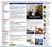
Magnews2 is a modern and creative free magazine and news website template that will help you kick off your online project in style.
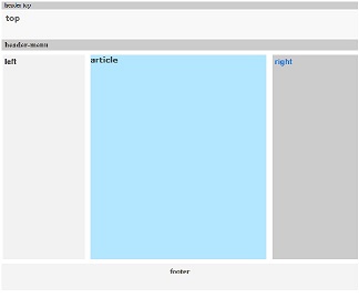
Find here examples of creative and unique website layouts.
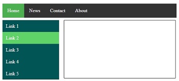
Find here examples of creative and unique website CSS HTML menu.
