CSS image shadow
CSS Tutorial � CSS images shadow
How do I add a shadow effect to an image in CSS?How do you create a drop shadow in CSS?
How do you put a shadow on a picture?
How do you add a shadow to a PNG in CSS?
Which property is used to create a shadow around an image?
With CSS3 you can add shadow to image element.
In this chapter you will learn about the box-shadow properties.
Inline�- by using the style attribute in HTML elements
Internal�- by using a <style> element in the <head> section
External�- by using an external CSS Style file as style.css
Inline CSS and HTML Syntax:
Internal CSS and HTML Syntax:
<style>
.selector_name { property: value; }
</style>
<body>
<img class = "selector_name" src = "image_link" />
</body>
<html>
by using an external CSS Style file as style.css where we add CSS Style .selector_name { property: value; }
External CSS and HTML Syntax:
<head>
<link rel="stylesheet" href="style.css" type="text/css" />
</head>
<body>
<img class = "selector_name" src = "image_link" />
</body>
<html>
How to add images shadow effect in HTML using CSS?: The picture below are: box-shadow: 7px 14px green for the first picture and box-shadow: 10px 10px 20px blue for the second.

CSS image shadow effect
CSS offers two separate properties for adding shadows to an image inside of container, box, div and to a text: box-shadow and text-shadow
For a better understanding we present an example:
<!DOCTYPE html>
<html>
<head>
<title>CSS image shadow effect</title>
<style>.shadow_effect1 {
border-radius:30px;
box-shadow: 7px 14px green;
margin-right:20px;
height: 230px;
width: 220px;
}
.shadow_effect2 {
border:medium dashed #039;
box-shadow: 10px 10px 20px blue;
height: 230px;
width: 220px;
}
</style>
</head>
<body>
<h2>CSS image shadow effect</h2>
<img class="shadow_effect1"
src="https://www.agernic.com/templates/mariwel.jpg"
alt="news templates"/>
<img class="shadow_effect2"
src="https://www.agernic.com/layout/best-responsive-layout.jpg"
alt="news templates" />
</body>
</html>
Related subjects:
CSS align image center
CSS rounded corners image
CSS image
CSS image center
It is also possible to add shadow inside a container, box or div in CSS.
To set this property, you must use the "inset" setting at the beginning of the "box-shadow" statement.
<!DOCTYPE html>
<html>
<head>
<title>CSS image shadow effect</title>
<style>
div{
width: 250px;
height: 240px;
border:2px solid red;
box-shadow: inset 0px 0px 30px black;
}</style>
</head>
<body>
<h2>CSS image shadow effect</h2>
<div>inner shadows by including the inset value at the beginning of the box-shadow declaration:</div>
</body>
</html>
CSS image shadow on hover effect
Hovering over a box or item gives us the ability to animate changes to a CSS property value.
In the following example, we will continue with the different types of effects created specifically for use with images.
<!DOCTYPE html>
<html>
<head>
<title>css image shadow on hover effect</title>
<style>
.shadow_effect1 {
border-radius:30px;
box-shadow: 7px 14px green;
margin-right:20px;
height: 230px;
width: 220px;
}
.shadow_effect2 {
border:medium dashed #039;
box-shadow: 10px 10px 20px blue;
height: 230px;
width: 220px;
}
.shadow_effect1:hover{
opacity: 0.6; /* 1 = 100%, 0 = 0% */
/* or the drop-shadow effect */
box-shadow: 0 6px 18px green; /* goes x-axis, y-axis, blur, (stretch factor on x-axis, not used here), colour */
}
.shadow_effect2:hover {
opacity: 0.8; /* 1 = 100%, 0 = 0% */
/* or the drop-shadow effect */
box-shadow: 0 6px 18px blue; /* goes x-axis, y-axis, blur, (stretch factor on x-axis, not used here), colour */
}
</style>
</head>
<body>
<h2>css image shadow on hover effect</h2>
<img class="shadow_effect1"
src="https://www.agernic.com/templates/mariwel.jpg"
alt="news templates"/>
<img class="shadow_effect2"
src="https://www.agernic.com/layout/best-responsive-layout.jpg"
alt="news templates" /></body>
</html>
CSS image aspect ratio
So you put an image on your webpage and decided to resize it a little bit, but there was a small issue and the image is out of proportion.
To maintain the aspect ratio of images in CSS, the easiest way is to set the width of the image, then the height automatically or the other round
<!DOCTYPE html>
<html>
<head>
<title>css image shadow on hover effect</title>
<style>
.shadow_effect1 {
border-radius:30px;
box-shadow: 7px 14px green;
margin-right:20px;
height: 230px;
width: 220px;
}
.shadow_effect2 {
border:medium dashed #039;
box-shadow: 10px 10px 20px blue;
height: 230px;
width: 220px;
}
.shadow_effect1:hover{
opacity: 0.6; /* 1 = 100%, 0 = 0% */
/* or the drop-shadow effect */
box-shadow: 0 6px 18px green; /* goes x-axis, y-axis, blur, (stretch factor on x-axis, not used here), colour */
height: auto;
width: 240px;
}
.shadow_effect2:hover {
opacity: 0.8; /* 1 = 100%, 0 = 0% */
/* or the drop-shadow effect */
box-shadow: 0 6px 18px blue; /* goes x-axis, y-axis, blur, (stretch factor on x-axis, not used here), colour */
height: 200px;
width: auto;
}
</style>
</head>
<body>
<h2>css image shadow on hover effect</h2>
<img class="shadow_effect1"
src="https://www.agernic.com/templates/mariwel.jpg"
alt="news templates"/>
<img class="shadow_effect2"
src="https://www.agernic.com/layout/best-responsive-layout.jpg"
alt="news templates" /></body>
</html>
css image shadow: effect, generator, png, on hover, inside, overlay, examples, bottom only, top.
CSS image shadow - css tutorial
This tool makes it easy to create, adjust, and experiment with custom colors for the web.

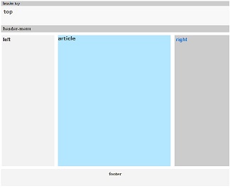
Magnews2 is a modern and creative free magazine and news website template that will help you kick off your online project in style.

Find here examples of creative and unique website layouts.
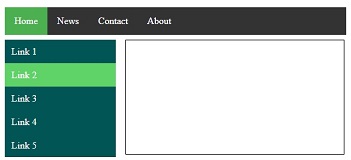
Find here examples of creative and unique website CSS HTML menu.
