Create CSS Table Responsive
CSS Tutorial � CSS Table Responsive
Receptive design refers to adjusting the design to fit certain screens of different sizes such as mobile, tablets.
So what happens when a screen is narrower than the minimum width of a data table?
Inline�- by using the style attribute in HTML elements
Internal�- by using a <style> element in the <head> section
External�- by using an external CSS Style file as style.css
Internal CSS and HTML Syntax:
<style>
th, td { text-align: value; }
</style>
<body>
<table>
<tr>
<th>title_text</th> <!-- each line one column -->
...
...
...
</tr>
<tr>
<td>content</td> <!-- each line one column -->
...
...
...
</tr>
</table>
</body>
<html>
In this chapter we learn how to make responsive table.
| ID | Nombre | Apellido | |
|---|---|---|---|
| 1 | Clark | Kent | clarkkent@mail.com |
| 2 | John | Carter | johncarter@mail.com |
| 3 | Peter | Parker | peterparker@mail.com |
Browser Support CSS responsive table
| Element |  �Chrome |
 �IE |
 �Firefox |
 �Opera |
 �Safari |
| Browser Support option | Yes | Yes | Yes | Yes | Yes |
CSS Table Align Center
If you have a table that is wide enough, you can add a container element such as overflow-x: auto around the table and it will display a horizontal scroll bar when needed.
<!DOCTYPE html>
<html>
<head>
<style>
th, td {
padding:8px;}
h2 {
color:blue;}
</style>
</head>
<body>
<h2>CSS responsive table</h2><p>If you have a table that is wide enough,
you can add a container element such as overflow-x:
auto around the table and it will display a horizontal
scroll bar when needed.</p>
<div style="overflow-x:auto;">
<table align="center" style="width:900px">
<thead>
<tr style="background:#0C6; padding:8px">
<th>ID</th>
<th>Nombre</th>
<th>Apellido</th>
<th>Email</th>
</tr>
</thead>
<tbody>
<tr style="border:thin #FFF; background: #CCC">
<th>1</td>
<th>Clark</td>
<th>Kent</td>
<th>clarkkent@mail.com</td>
</tr>
<tr>
<th>2</td>
<th>John</td>
<th>Carter</td>
<th>johncarter@mail.com</td>
</tr>
<tr style="border:thin #FFF; background: #CCC">
<th>3</td>
<th>Peter</td>
<th>Parker</td>
<th>peterparker@mail.com</td>
</tr>
</tbody>
</table>
</div></body>
</html>
Related subjects:
CSS table
CSS table border
Padding top bottom left right
CSS Table Padding
CSS Table size width and height
CSS Table Alignment
Tags: css table responsive columns, width, mobile, height, scroll, template, design, layout
How can I make my mobile table responsive
How can I make my mobile table responsive?
Can we make table responsive?
How do I make a table row responsive in HTML?
What is a responsive table in CSS?
How do I design css table
Tables are among the most commonly used components on a web page.
css table responsive columns, width, mobile, height, scroll, template, design, layout
Create CSS Table Responsive - css tutorial
This tool makes it easy to create, adjust, and experiment with custom colors for the web.

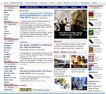
Magnews2 is a modern and creative free magazine and news website template that will help you kick off your online project in style.

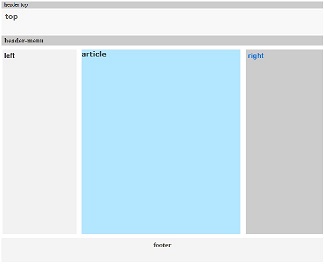
Find here examples of creative and unique website layouts.

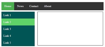
Find here examples of creative and unique website CSS HTML menu.

