Bootstrap Grids
Bootstrap's grid system allows up to 12 columns across the page.
Grid-based page layout is done by rows and columns where the contents are placed. Here's how the Bootstrap grid works:
1. Rows are always defined within a container of type .container (fixed width) or of type .container-fluid (variable width). This way the rows line up well and show the correct padding.
2. Rows are used to horizontally group multiple columns.
3. The content is always placed inside the columns, since the rows should only contain column type elements..
4. Bootstrap defines many CSS classes (such as .row and .col-xs-4) to quickly create grids. There are also Less mixins to create more semantic designs.
5. The separation between columns is done by applying padding. To counteract its effects on the first and last columns, the rows (.row elements) apply negative margins.
6. The grid columns define their width by specifying how many of the 12 columns in the row they occupy. If, for example, you want to divide a row into three equal columns, you would use the class .col-xs-4 (the 4 indicates that each column occupies 4 of the 12 columns into which each row is divided).
Media queries.
Bootstrap uses the following media queries to set the different breakpoints at which the grid transforms to suit each device.
/ * Very small devices (phones up to 768px wide) * /
@media (min-width: @ screen-xm-min) {...}
/ * Small devices (tablets, width greater than or equal to 768px) * /
@media (min-width: @ screen-sm-min) {...}
/ * Medium devices (computers, width greater than or equal to 992px) * /
@media (min-width: @ screen-md-min) {...}
/ * Large devices (computers, width greater than or equal to 1200px) * /
@media (min-width: @ screen-lg-min) {...}
The following media queries are used that define the max-width property and allow restricting the devices to which the CSS styles are applied:
@media (max-width: @screen-xs-max) { ... }
@media (min-width: @screen-sm-min) and (max-width: @screen-sm-max) { ... }
@media (min-width: @screen-md-min) and (max-width: @screen-md-max) { ... }
@media (min-width: @screen-lg-min) { ... }
Grid example created with Bootstrap
The following example shows how to create a grid with the .col-md- * classes.
On mobile devices (extra small or small) this grid is displayed vertically, but on a computer (medium or large) it is displayed horizontally.
<!DOCTYPE html>
<html lang="en">
<head>
<title>Bootstrap Example</title>
<meta charset="utf-8"><meta name="viewport" content="width=device-width, initial-scale=1">
</body>
<link rel="stylesheet" href="https://maxcdn.bootstrapcdn.com/bootstrap/3.4.1/css/bootstrap.min.css">
<script src="https://ajax.googleapis.com/ajax/libs/jquery/3.5.1/jquery.min.js"></script>
<script src="https://maxcdn.bootstrapcdn.com/bootstrap/3.4.1/js/bootstrap.min.js"></script>
<div class="container show-top-margin separate-rows tall-rows">
<div class="row show-grid">
<div class="col-md-1">.col-md-1</div>
<div class="col-md-1">.col-md-1</div>
<div class="col-md-1">.col-md-1</div>
<div class="col-md-1">.col-md-1</div>
<div class="col-md-1">.col-md-1</div>
<div class="col-md-1">.col-md-1</div>
<div class="col-md-1">.col-md-1</div>
<div class="col-md-1">.col-md-1</div>
<div class="col-md-1">.col-md-1</div>
<div class="col-md-1">.col-md-1</div>
<div class="col-md-1">.col-md-1</div>
<div class="col-md-1">.col-md-1</div>
</div>
<div class="row show-grid">
<div class="col-md-8">.col-md-8</div>
<div class="col-md-4">.col-md-4</div>
</div>
<div class="row show-grid">
<div class="col-md-4">.col-md-4</div>
<div class="col-md-4">.col-md-4</div>
<div class="col-md-4">.col-md-4</div>
</div>
<div class="row show-grid">
<div class="col-md-6">.col-md-6</div>
<div class="col-md-6">.col-md-6</div>
</div>
</div>
</html>
Bootstrap Text&Typography
Bootstrap's Default Settings
Bootstrap's global default font-size is 14px, with a line-height of 1.428.
This is applied to the�<body>�element and all paragraphs (<p>).
In addition, all�<p>�elements have a bottom margin that equals half their computed line-height (10px by default).
Headlines
Bootstrap 3 defines default styles for all levels of page headlines, from <h1> to <h6>.
Example:
<h1> h1. Bootstrap heading (36px) </h1>
<h2> h2. Bootstrap heading (30px) </h2>
<h3> h3. Bootstrap heading (24px) </h3>
<h4> h4. Bootstrap heading (18px) </h4>
<h5> h5. Bootstrap heading (14px) </h5>
<h6> h6. Bootstrap heading (12px) </h6>
Bootstrap also defines special styles for <small> elements included within a banner and commonly used to display secondary information.
Example:
<h1>h1. Bootstrap heading <small>Secondary text</small></h1>
<h2>h2. Bootstrap heading <small>Secondary text</small></h2>
<h3>h3. Bootstrap heading <small>Secondary text</small></h3>
<h4>h4. Bootstrap heading <small>Secondary text</small></h4>
<h5>h5. Bootstrap heading <small>Secondary text</small></h5>
<h6>h6. Bootstrap heading <small>Secondary text</small></h6>
Text
Bootstrap 3's default font-size is 14px and line-height is 1.428.
These values apply to both the <body> and all paragraphs. The latter also include a lower margin whose value is half its line spacing (10px by default).
<p>your any text here between(<p> and </p>) </p>
Featured text
To make a paragraph stand out from the rest, add the class .lead. Example:
<p class = "lead"> Any text here. </p>
Unimportant text in Bootstrap3
To mark part of text or an entire block of text as unimportant, use the <small> tag. Bootstrap displays that content with a font size equal to 85% of the font size of its parent element. In the case of headlines (<h1>, ..., <h6>) the size of the <small> elements is adjusted differently to make them look better.
Example:
<p> your text here <small> This text content will look smaller and can be used for example for the "fine print" of the page. </small> </p>
Bold text
Use the <bold> tag to add emphasis to text by displaying it in bold.
Example:
<p> The following piece of text <strong> is shown in bold </strong>. </p>
Italic text
Use the <em> tag to add emphasis to text by displaying it in italics. This emphasis is less important than that defined by the <strong> tag.
Example:
<p> The following piece of text <em> is shown in italics </em>. </p>
Bootstrap font-family, Bootstrap font-size, Bootstrap text color, Google fonts, Muted bootstrapBootstrap font-family, Bootstrap font-size, Bootstrap text color, Google fonts, Muted bootstrap
Bootstrap Text - Typography - bootstrap
This tool makes it easy to create, adjust, and experiment with custom colors for the web.
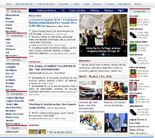
Magnews2 is a modern and creative free magazine and news website template that will help you kick off your online project in style.
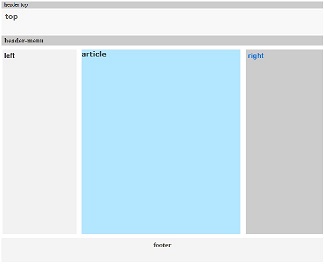
Find here examples of creative and unique website layouts.
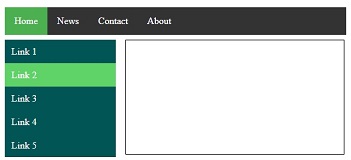
Find here examples of creative and unique website CSS HTML menu.
